Origins
I’ve always kinda been into graphic design; creating unique edits to different websites and even movie posters was a hobby of mine. My brother is currently a successful graphic designer, and I remember a day (I was about 9 or 10 years old) when he was working on a commission website for a start-up his friend created. I sat down beside him and just gazed in awe as he moved text, added colours, and arranged the layout while explaining it all to me the best he could. It didn’t fully dawn on me then, but I now realize how creative and thought-out the design process really is. Every space and font on the page of creative design has a part in the bigger picture.
Even though that moment offered a big peek into the effort of design, I’m now learning that it’s quite a bit harder to do in practice. I’m a slight computer nerd, so I know the in’s and out’s of basic Adobe programs, but starting off with InDesign (a layout software) has proven difficult. The UI and how it looks is similar to Photoshop, but it has aspects that I’m still figuring out. As of writing this Blog, I have produced 20 rough pages of a cookbook, stylized and designed (not including finalized images, recipes, or text).

Too Much Without Looking “Too Much”
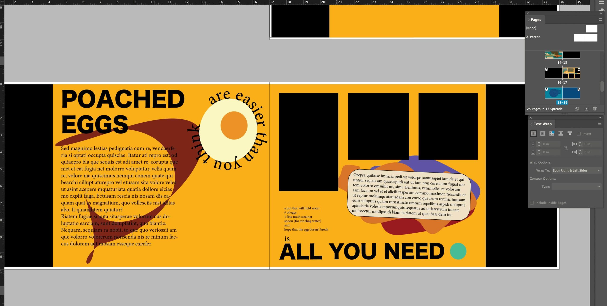
Since my cookbook is meant to be a graphic design book, like one would have out on the living room table because it looks pretty and is fun to look through, the actual “look” of it matters a lot. I was initially wanting to have a solid colour scheme throughout (like the colour seen on the “poached eggs” page here) but realized through rounds of feedback and critique that it would get very stylistically stagnant. So, I opted for a wide array of colour, especially vibrant colour, giving me more direction for unique “stand out” pages.
Colour Theory? Nah, I’m Doing What Looks Cool
One suggestion I received during some feedback was to use colour for expressing different foods and their attributes. For example, a breakfast using batter, like pancakes or french toast, could be associated with more subdued browns, yellows, and earthy red’s and oranges. OR, one could associate that food with bright yellows, woody greens, and magenta. Style is different for everyone, so I’m going with my interpretation for different meals (and what I think looks pretty lol).
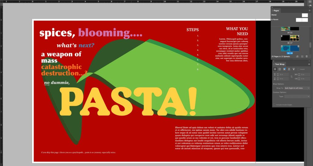
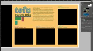
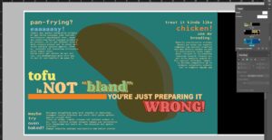
Some Sort of Controlled Chaos
Another fun part that I’m enjoying with design is regarding the different ‘tips’ in the book. They are always accompanied by a recipe or two, and when designing these “sections”, I’m creating each with a similar vibe to it for continuity. For example, in my spices section, I use very bold colours utilize contrast and BIG emphasizing text. Very in-your-face. Contrasting that is the tofu section, which uses a typewriter font that I love, with simple, more muted colours, and complimenting, calmer text.
Plan For The Future
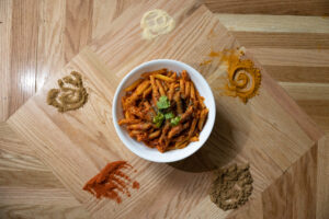
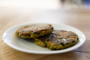
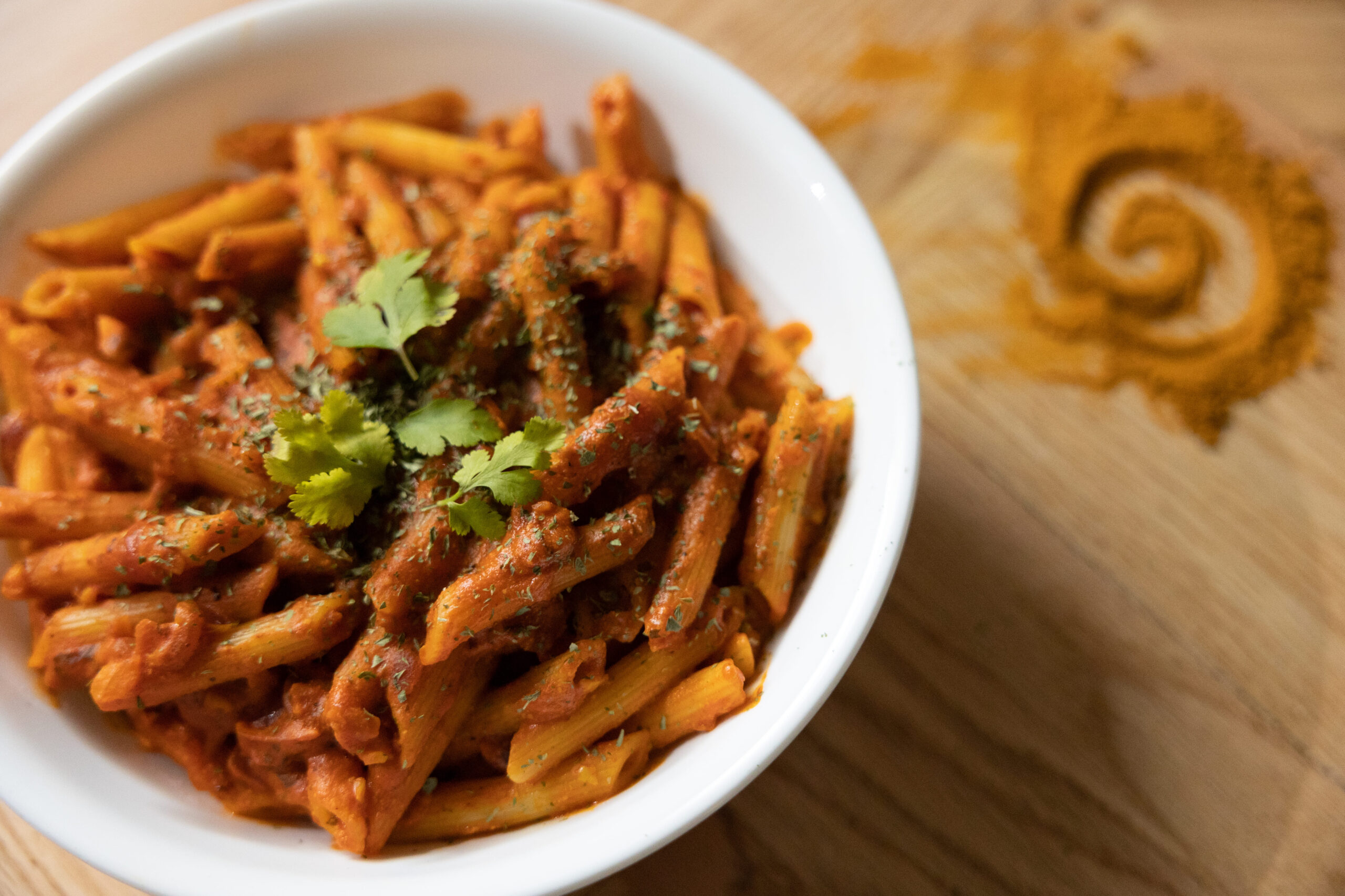
Going forward I plan to finish more, if not all the stylized pages of the cookbook by early May and after, complete the recipe’s text and writing. Since these recipes are ones I cook day-to-day, I’m lucky to be taking photos of the food I cook at home and in the kitchen at school throughout. A plus of cooking and photo shooting in my own kitchen, is that I can be as messy as I want 🙂